Brand Designer & Art Director shaping brands through systems and storytelling.
1.6×
team growth performance
×2
design process speed
3+
design team expansion
97
company rating score
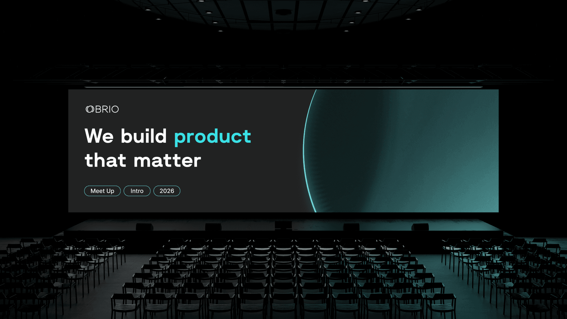
OBRIO — Product IT Company
OBRIO is a product IT company building digital platforms focused on self-discovery and spirituality for a global audience. As the company scaled internationally, its employer brand identity no longer reflected the maturity, ambition, and cultural evolution of the organization.

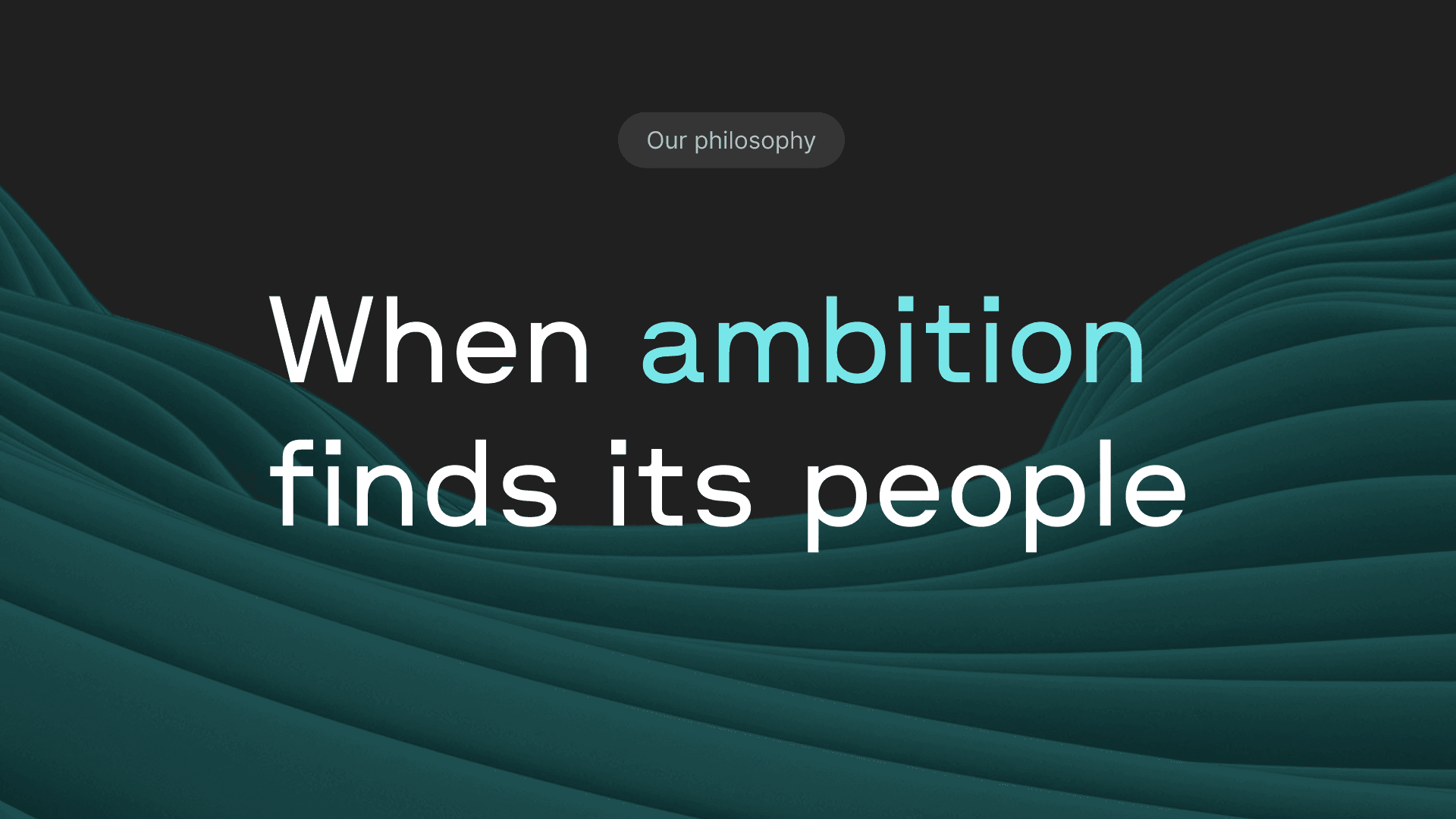
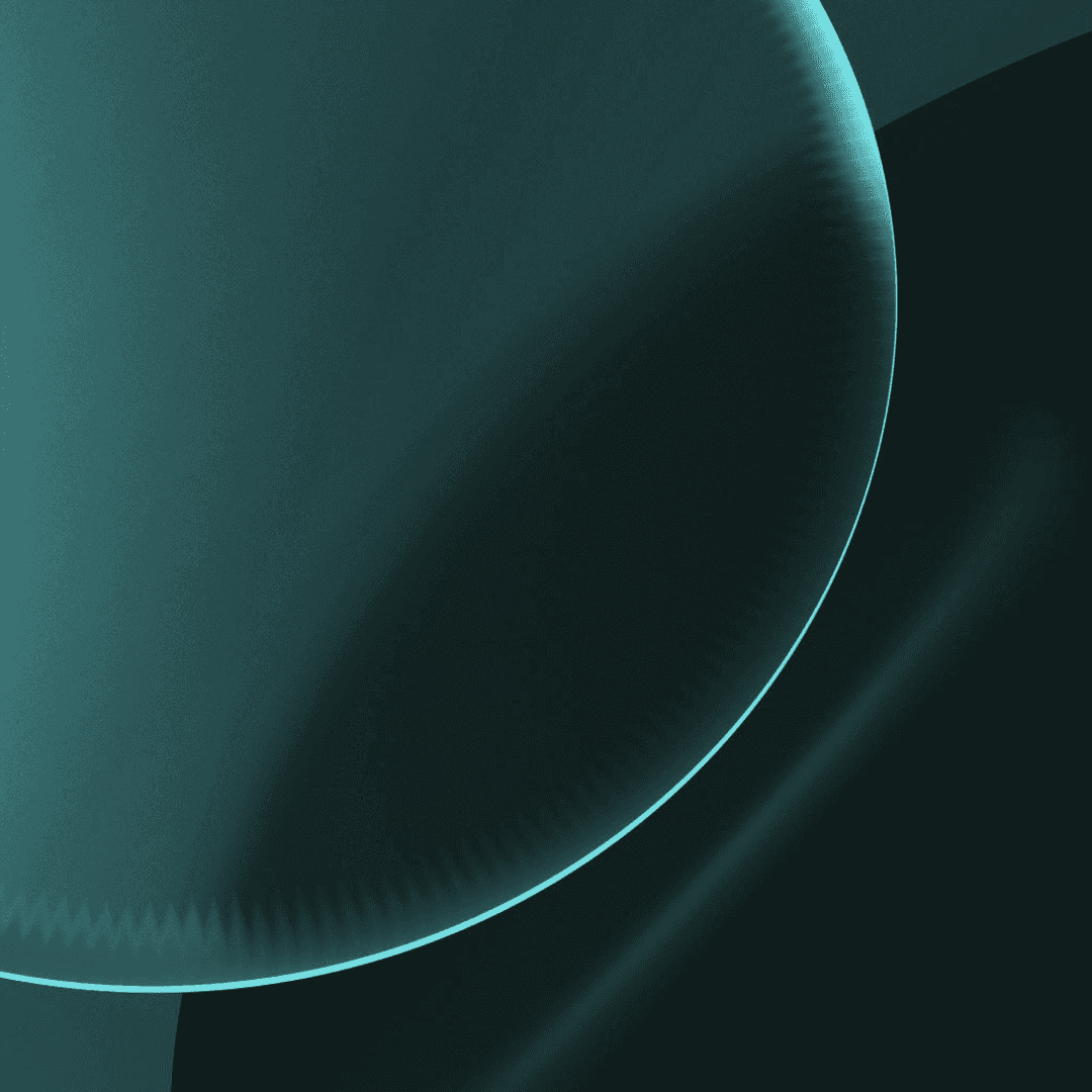
The search for a conceptual core led to a reinterpretation of the logo, built from two intersecting circles. The forms became a metaphor for the brand — connecting people and ambition — and evolved into the central principle of the visual language: interaction, transformation, and movement.
The circle became the fundamental unit of the identity, driving compositions, transitions, and dynamic behaviors across the system.

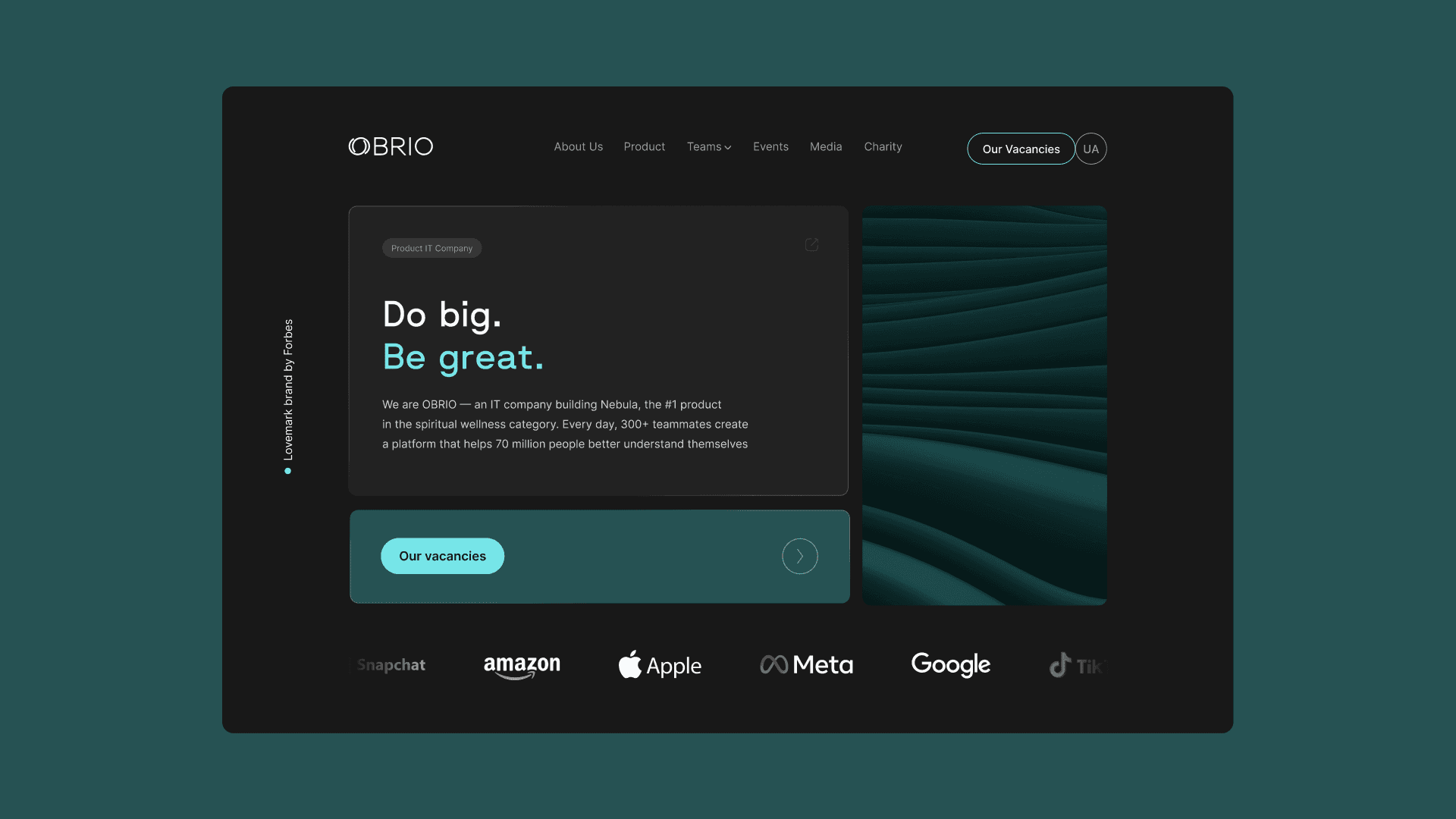
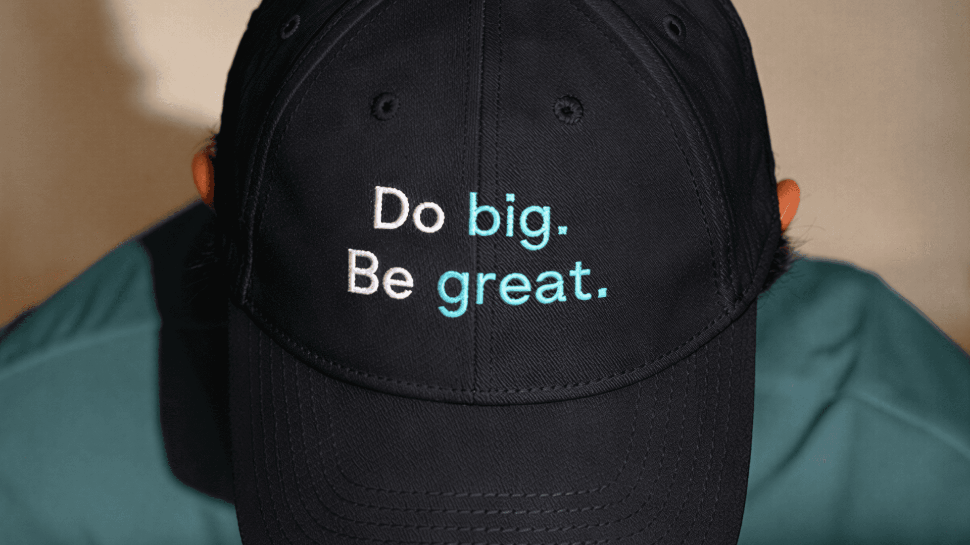
The redesign refined the logo by increasing clarity and visual presence, strengthening recognition while preserving brand continuity. A new typographic system replaced conservative choices with a contemporary set that emphasized technological confidence and performed consistently across digital environments.
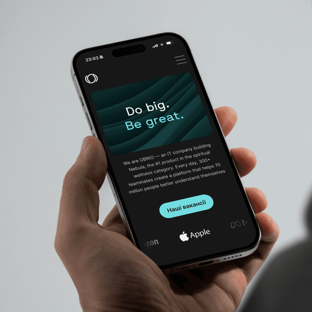
The identity introduced a modular bento grid framework, enabling scalable communication across presentations, social media, and product materials. An expanded color palette increased contrast and flexibility, while comprehensive brand guidelines transformed the identity into an operational tool for both designers and non-design teams.
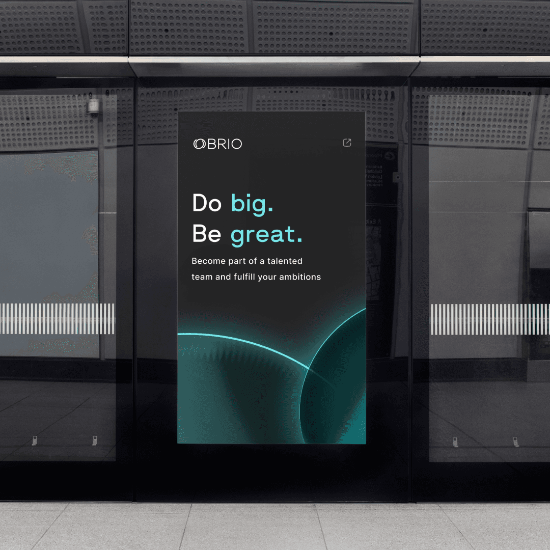
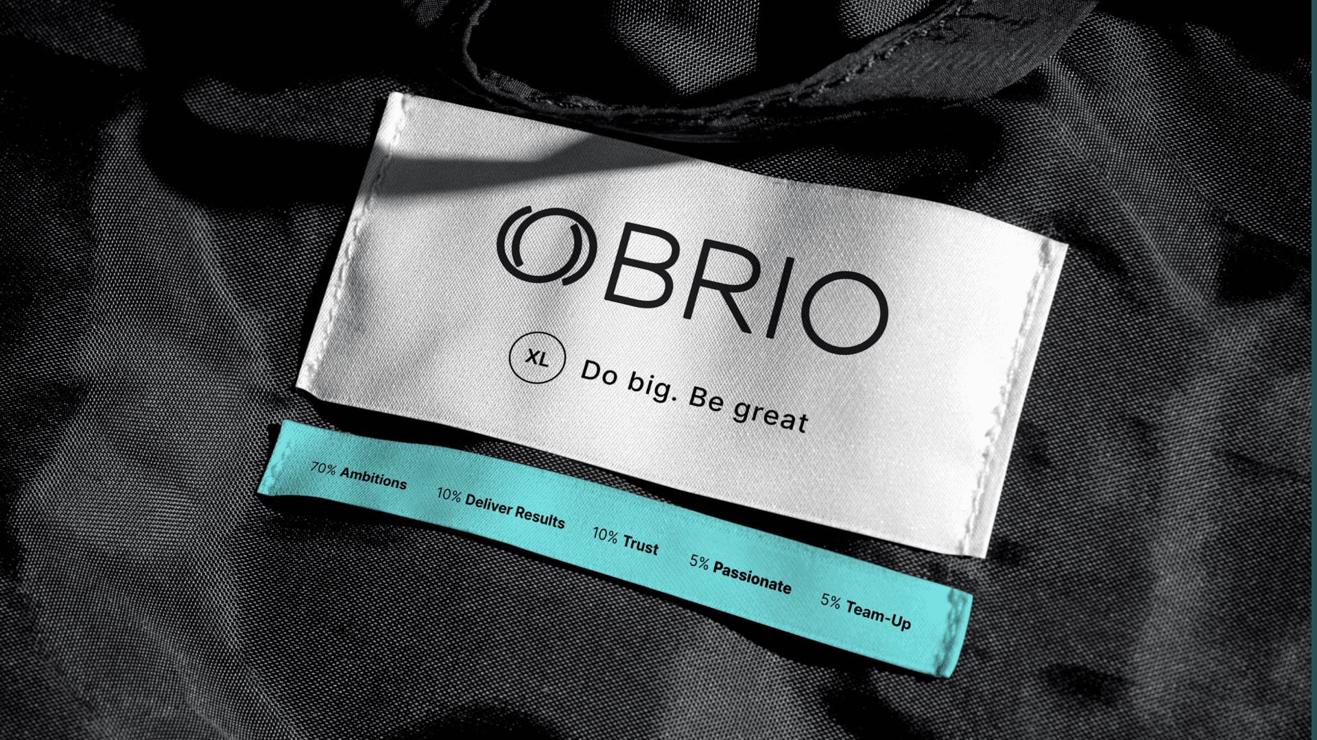
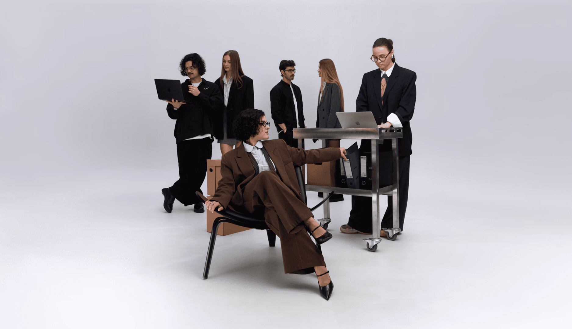
The system expanded through the development and art direction of the company’s website visual concept, followed by an SMM Guidebook, event and CSR sub-identities, merchandise, and spatial brand applications — extending the brand consistently across digital and physical environments.


I initiated and led the redesign from research to rollout, working closely with C-level stakeholders to align visual communication with long-term business strategy. Alongside creative direction, I scaled design operations by hiring and mentoring designers and introducing structured briefing practices.
These changes optimized workflows and transformed brand design into a sustainable operational infrastructure supporting the company’s growth.
RESULTS
The new OBRIO identity evolved into a living system, adaptable across teams, platforms, and environments. It reduced approval cycles, doubled SMM production speed, and supported rapid company growth, including a 1.6× team expansion in 2025 and entry into international markets such as Poland.
As the system scaled, the design team expanded with two in-house designers and two freelance collaborators, establishing a sustainable production structure. The strengthened brand presence contributed to the Forbes “Love Mark Brand” recognition and a 97-point DOU company rating.
The identity transformed OBRIO into a cohesive brand ecosystem connecting people, products, and ambition.
CREDITS
Art Direction: Dmytro Shelestynskyi
Design: Dmytro Shelestynskyi, Olha Verkhola
Web Design: Dmytro Shelestynskyi, Olha Verkhola
Photo: Shakirova Stanislava